
Let’s talk about logos… or more specifically, my logo
Logo design…it can be a tough one. I came up with several different logos in the process of creating a brand for my portfolio. I think it’s toughest to create a logo for yourself. You don’t hand it off to a client after it’s approved, you are constantly looking at it and have the ability to change it. #designerproblems
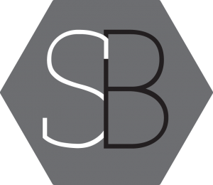
This was one version of my logo. I can’t really say many good things about it. I thought I was content with it, until one day I just wasn’t. I love the color grey. I seriously have grey touches in every room of my house. I think that is why I went with it for this logo, but this logo is super bland in my opinion.
I came up with my current logo while doodling one day, I wasn’t even thinking about logos to be honest, I was just doodling my initials, and BAM! There was my inspiration.
![]()
Is it the most original logo ever? Probably not. Do I love it? Yes, I do. It’s simple and clean and that’s what I was looking for. The main emblem is the font Nexa Rust Script but you won’t find these letters in the actually typeface choices. I took the letters and customized them to look how I want. I actually think I used 5 different letters to make the two combined. I think that is what I love about it, it’s unique to me and not easily reproduced. The bottom font is Sinkin Sans, which is a very clean Sans Serif font.
![]()
That’s about all I have to say about my logo design. Let me know your thoughts. I love critiques from other people, it opens my eyes to perspectives I haven’t seen and I think they are the best way to grow as a designer.
Until next time,
-Stacey Bartron